What’s Hidden in the New York Times Maps of All the Buildings in America?
Much well deserved amazement and attention has been heaped on the recent map of “every building in America,” by Tim Wallace, Derek Watkins, and John Schwartz, published on 12 October 2018 in the New York Times. The Times’ interactive maps are a real treasure and a wonderful opportunity to explore the multiple geographies of the United States as one wishes. Their building map appears at this link: https://www.nytimes.com/interactive/2018/10/12/us/map-of-every-building-in-the-united-states.html
 |
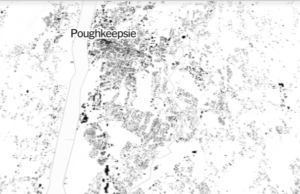
| City of Poughkeepsie NY from the NYT map. Buildings are black and everything else is white. |
As amazing and useful as this map is, as an urban ecologist, I am struck by some of its limits.
First, the map shows buildings in black, and everything else (read that again — everything else) in white. This is called “figure ground” by architects, and has been for hundreds of years the standard way to represent cities (e.g. Mayr and Mayr 2018). Big differences between cities show up this way.
The New York Times maps do us the huge favor of showing us figure-ground for an entire nation, based ultimately on some Microsoft computer wizardry. (Read THAT again: figure-ground for an entire nation.) This is pretty awesome. So awesome, that I had to resist the temptation to use terminology my Mother would not have approved of.
The maps show how urban form in its starkest form relates to big contrasts in how cities are laid out. The maps show the various continental patterns of urbanization, the influence of land tenure in the different European colonial powers, the role of major contrasts in topography, and the culture of land parcelization throughout the nation. These are — again — amazing patterns to see. And that the Times has made this treasure available to all of us is pretty neat.
OK, so what is wrong with this wonderful map. The “everything else” is a problem. Garry Peterson of the Stockholm Resilience Centre has reminded us that the large among of infrastructure associated with all these buildings is invisible in these maps. Somewhere in all that white space, there are paved streets, walks, and car parks; there are wires, cables, and pipes of multiple clean and waste-bearing sorts; and — from my bioecological perspective — there are at least trees, grass, shrubs, wildlife, pests, microbes, streams, wetlands, rock outcrops, and bare soil.
In other words these wonderful maps entirely miss the fact that our urban places — cities, suburbs, exurbs — are ecosystems. They have the buildings roughly represented by these wonderful maps, but they also have constructed and reshaped surfaces, biological organisms, the deep physical context of the places covered, filled or “reclaimed” for building on, and more social components than I can fairly even wave my hand at here.
These black-on-white maps have been bread and butter for urbanism for hundreds of years. But they deceive us into thinking that cities are physical things. Even worse, they seduce us into thinking that cities are only built. At best the usual antidote to this seduction is the equally simple idea that cities are primarily social phenomena.
No. These things are all wrong, even though useful on some levels. Cities are hybrid ecosystems, meaning that biology, society, construction, and physical fundamentals (geology, soils, climate, and so on) interact in the spaces so glibly shown as figure ground.
Don’t be taken in by this overly simplistic beauty. Use it as an entry to the real complexity and “multicolored” beauty of urban places.
Steward T.A. Pickett
Sources:
The NYT article on the interactive map: https://www.nytimes.com/interactive/2018/10/12/us/map-of-every-building-in-the-united-states.html
Mayr and Mayr 2018 with some nice background on the utility of Figure/Ground diagrams: http://www.citiesplus.org/post/99163685476/figure-ground-diagrams-tell-stories


